
WTF Re: Data Visualization
Heidi Steiner
Spring 2023
Today’s Map
Why visualize?
Limitations
Types of Visualizations
Tools + tips + takeaways

Why visualize?
Discover patterns that may not be obvious from numerical summaries
For Example…
| dataset | n | Average x | Average y |
|---|---|---|---|
| Dataset 1 | 142 | 54.3 | 47.8 |
| Dataset 2 | 142 | 54.3 | 47.8 |
| Dataset 3 | 142 | 54.3 | 47.8 |
| Dataset 4 | 142 | 54.3 | 47.8 |
| Dataset 5 | 142 | 54.3 | 47.8 |
| Dataset 6 | 142 | 54.3 | 47.8 |
| Dataset 7 | 142 | 54.3 | 47.8 |
| Dataset 8 | 142 | 54.3 | 47.8 |
| Dataset 9 | 142 | 54.3 | 47.8 |
| Dataset 10 | 142 | 54.3 | 47.8 |
| Dataset 11 | 142 | 54.3 | 47.8 |
| Dataset 12 | 142 | 54.3 | 47.8 |
| Dataset 13 | 142 | 54.3 | 47.8 |
More summary statistics…
How, if at all, are these 13 datasets different from each other?
| dataset | n | Average x | Average y | St Dev x | St Dev y |
|---|---|---|---|---|---|
| Dataset 1 | 142 | 54.3 | 47.8 | 16.8 | 26.9 |
| Dataset 2 | 142 | 54.3 | 47.8 | 16.8 | 26.9 |
| Dataset 3 | 142 | 54.3 | 47.8 | 16.8 | 26.9 |
| Dataset 4 | 142 | 54.3 | 47.8 | 16.8 | 26.9 |
| Dataset 5 | 142 | 54.3 | 47.8 | 16.8 | 26.9 |
| Dataset 6 | 142 | 54.3 | 47.8 | 16.8 | 26.9 |
| Dataset 7 | 142 | 54.3 | 47.8 | 16.8 | 26.9 |
| Dataset 8 | 142 | 54.3 | 47.8 | 16.8 | 26.9 |
| Dataset 9 | 142 | 54.3 | 47.8 | 16.8 | 26.9 |
| Dataset 10 | 142 | 54.3 | 47.8 | 16.8 | 26.9 |
| Dataset 11 | 142 | 54.3 | 47.8 | 16.8 | 26.9 |
| Dataset 12 | 142 | 54.3 | 47.8 | 16.8 | 26.9 |
| Dataset 13 | 142 | 54.3 | 47.8 | 16.8 | 26.9 |
Even more stats…
| dataset | n | Average x | Average y | St Dev x | St Dev y | Correlation |
|---|---|---|---|---|---|---|
| Dataset 1 | 142 | 54.3 | 47.8 | 16.8 | 26.9 | -0.1 |
| Dataset 2 | 142 | 54.3 | 47.8 | 16.8 | 26.9 | -0.1 |
| Dataset 3 | 142 | 54.3 | 47.8 | 16.8 | 26.9 | -0.1 |
| Dataset 4 | 142 | 54.3 | 47.8 | 16.8 | 26.9 | -0.1 |
| Dataset 5 | 142 | 54.3 | 47.8 | 16.8 | 26.9 | -0.1 |
| Dataset 6 | 142 | 54.3 | 47.8 | 16.8 | 26.9 | -0.1 |
| Dataset 7 | 142 | 54.3 | 47.8 | 16.8 | 26.9 | -0.1 |
| Dataset 8 | 142 | 54.3 | 47.8 | 16.8 | 26.9 | -0.1 |
| Dataset 9 | 142 | 54.3 | 47.8 | 16.8 | 26.9 | -0.1 |
| Dataset 10 | 142 | 54.3 | 47.8 | 16.8 | 26.9 | -0.1 |
| Dataset 11 | 142 | 54.3 | 47.8 | 16.8 | 26.9 | -0.1 |
| Dataset 12 | 142 | 54.3 | 47.8 | 16.8 | 26.9 | -0.1 |
| Dataset 13 | 142 | 54.3 | 47.8 | 16.8 | 26.9 | -0.1 |
Hidden patterns!

EDA Tools
Software for Exploratory Data Analysis & Beyond
MS Excel, LibreOffice - Calc
R (e.g. ggplot2) and Python (e.g. seaborn)
Why visualize?
Convey information in a way that is otherwise difficult/impossible to describe

Source: [Financial Times](https://www.ft.com/content/a2901ce8-5eb7-4633-b89c-cbdf5b386938), 27 Aug 2021.

Major Data Viz Limitations
Computational
Do you have the compute power to visualize every data point? Probably not…
Do you need a graphics processing unit?
Do you know how to utilize your lab’s GPU?
Coordinate
Forget putting all your great insights into one figure!
Cognitive Limitations
Ranking of visual communication channels

Cognitive Limitations: Distance
Principle of Proportional Ink
For example:

Cognitive Limitations: Color

Lisa Charlotte Muth. What to consider when choosing colors for data visualization. Datawrapper. Published May 29, 2018. Accessed November 7, 2022. https://blog.datawrapper.de/colors/
Cognitive Limitations: Color

Lisa Charlotte Muth. What to consider when choosing colors for data visualization. Datawrapper. Published May 29, 2018. Accessed November 7, 2022. https://blog.datawrapper.de/colors/
Cognivite Limitations: Clutter

Wilke CO. Fundamentals of Data Visualization. Accessed November 7, 2022. https://clauswilke.com/dataviz/image-file-formats.html
Cognivite Limitations: Clutter

Wilke CO. Fundamentals of Data Visualization. Accessed November 7, 2022. https://clauswilke.com/dataviz/image-file-formats.html
Cognitive Limitations
Often the same visualization won’t work for every audience…
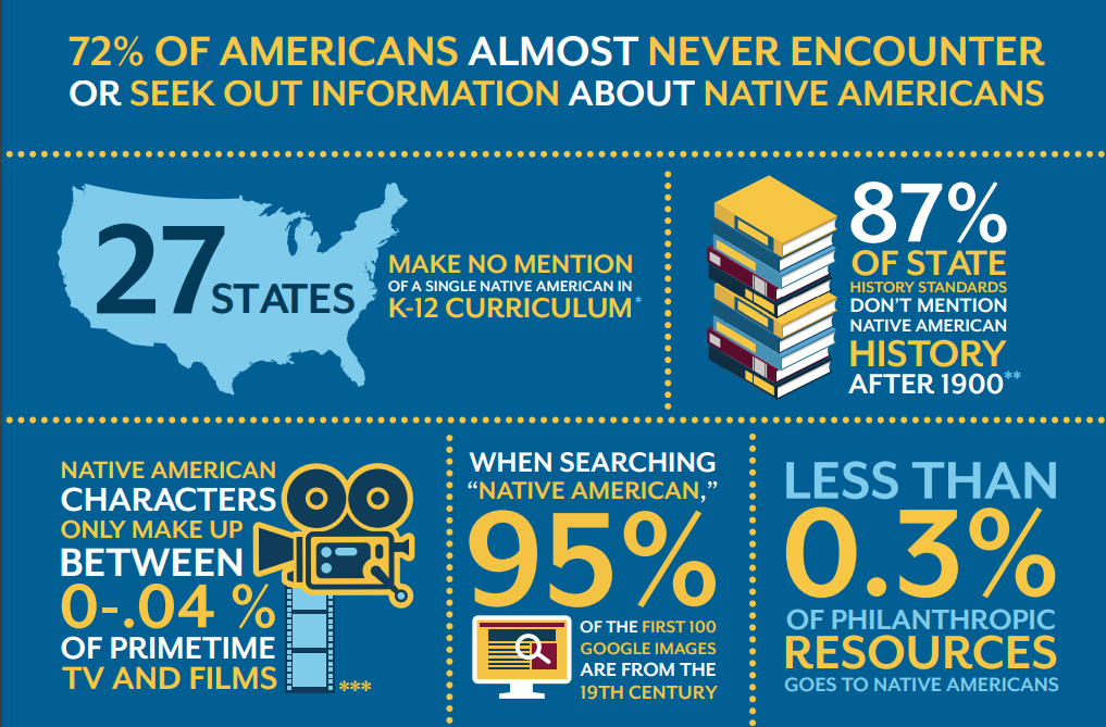
#SciComm
Graphical Abstracts
Infographics

#SciComm
Graphical Abstracts
Infographics

#SciComm
#SciComm Tools

Extra Data Viz Tools
InkSkape
JavaScript
Is there a field specific tool you might utilize?
Data are not neutral.
It’s easy to make a “bad” plot.
Bad Plots
Taste
Data
Perception
Bad Plots: Data

Bad Plots: Data

Data Viz Ethics
It is not good enough to commit to not misleading your audience.
Data Viz Ethics
Extra Thoughts: Exporting
| Acronym | Name | Type | Application |
|---|---|---|---|
| Portable Document Format | vector | general purpose | |
| eps | Encapsulated PostScript | vector | general purpose, outdated; use pdf |
| svg | Scalable Vector Graphics | vector | online use |
| png | Portable Network Graphics | bitmap | optimized for line drawings |
| jpeg | Joint Photographic Experts Group | bitmap | optimized for photographic images |
| tiff | Tagged Image File Format | bitmap | print production, accurate color reproduction |
| raw | Raw Image File | bitmap | digital photography, needs post-processing |
| gif | Graphics Interchange Format | bitmap | outdated for static figures, Ok for animations |
Vector graphics redrawn “on the fly” vs bitmap always bitmap
Bitmap Compression (to keep file sizes small)
Lossless = pixel-for-pixel identical
Lossy = accepts some image degradation in return for smaller file sizes
- great for photos, can’t make lines
Rule of Thumb: Store visualization in maximum resolution format, copy at lower resolutions when necessary
Extra Thoughts: Text
- Is your font readable at the smallest printed size?
- Do you need to left align?

Extra Thoughts: Accessibility
Check that your plots are color blind friendly
Add alt-text to #scicomm
Questions?
